People say that Bitcoin should never be sold in the long term. Is that true?
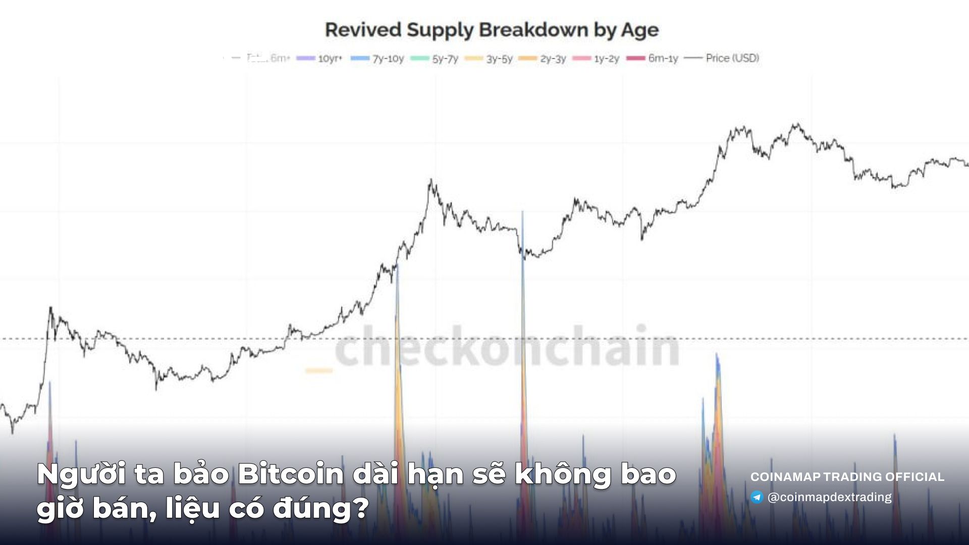
The market is absorbing the largest sell-off in history, at the highest price range ever, yet Bitcoin's price remains strong.
Chart Explanation:
The chart shows:
Black line: Bitcoin price (USD) over time.
Colored areas (stacked area): Represent the amount of Bitcoin supply that has been "revived" (Revived Supply Breakdown by Age). Different colors represent the age of the activated coins, such as:
<6 months
1-2 years
5-7 years, etc.
Key points:
The peaks in the colored areas align with periods when a large amount of old Bitcoin was sold, such as in 2018 (the market bottom) or during the BCH hard fork.
Currently, the selling volume from old coins has reached a historic high, but Bitcoin’s price remains elevated, indicating strong market absorption.
#COINMAP
—————

Related posts

Latest

Subscribe
Subscribe with your email to receive information and promotions from 8xTrading